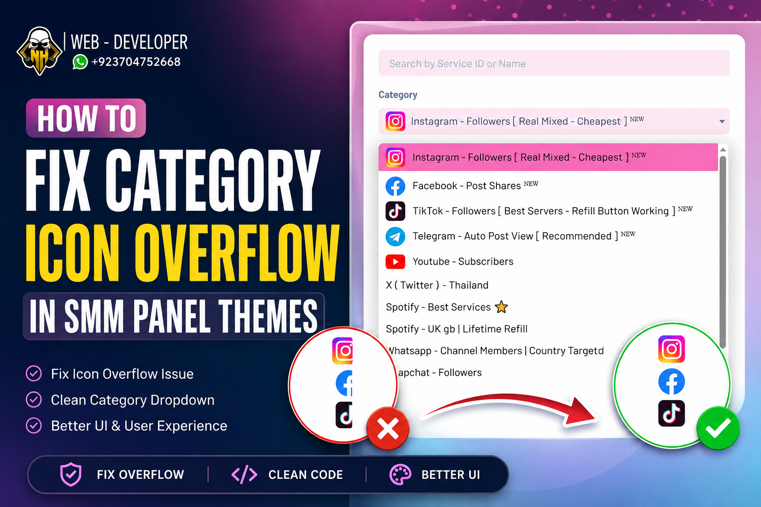
You just installed a premium SMM panel theme, uploaded your custom category icons, and suddenly the “New Order” page is completely broken category icon overflow. Huge icons are overlapping the dropdown menus, pushing your service text off the screen, and ruining the layout.
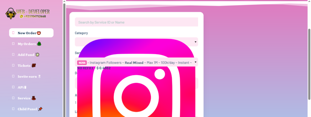
I fix this exact category icon overflow issue almost every week for panel owners.
The problem is not the icons you uploaded. The problem is that default SMM panel themes (especially SMMspot-based themes) often fail to strictly define image boundaries inside their select menus. When a user uploads an icon that is 500×500 pixels, the browser tries to render it at full size, destroying your flexbox and grid layouts.
Here is the exact CSS patch I use to force absolute uniformity across all category and service icons, ensuring your order page stays perfectly responsive.
The Global Category Icon Overflow CSS Fix
To fix the category icon overflow, we need to apply strict dimensions to the images inside the dropdown containers and use the !important tag to override the theme’s native stylesheet.
Copy the following CSS code:
CSS
/* Category and Service icons size normalization */
#neworder_category img,
#neworder_services img,
.smmspot-sb-dd-item img,
.smmspot-sb-selected img,
#order-form img {
    width: 24px !important;
    height: 24px !important;
    margin-right: 10px !important;
    vertical-align: middle !important;
    object-fit: contain !important;
    display: inline-block !important;
}

/* Responsive adjustment for mobile screens */
@media (max-width: 768px) {
    #neworder_category img,
    #neworder_services img {
        width: 20px !important;
        height: 20px !important;
    }
}
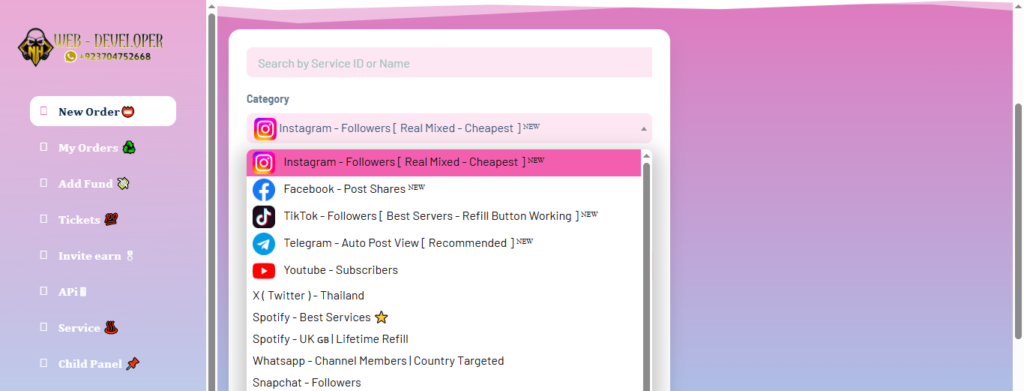
How This Code Works
If you just paste code without understanding it, debugging future issues becomes impossible. Here is exactly what this snippet is doing to your panel’s architecture:
- Targeting the Right Elements: We specifically target
#neworder_category imgand#neworder_services imgto ensure only the icons inside the order form are affected. - Hardcoding Dimensions: The code forces every icon to perfectly render at 24×24 pixels. This stops large image uploads from breaking the container boundaries.
- Preventing Distortion: Applying
object-fit: contain !important;guarantees that your images will never stretch or distort, regardless of their original aspect ratio. - Fixing Alignment: Setting the margin to 10px and vertical alignment to the middle ensures the icon sits perfectly level with your category text.
Handling Mobile Responsiveness
Mobile users generate the vast majority of SMM panel orders. A 24px icon might look great on a desktop monitor, but it takes up too much valuable screen real estate on a phone.
The media query at the bottom of the snippet watches for screens smaller than 768px. When a user loads your panel on a mobile device, it instantly shrinks the target icons down to 20×20 pixels. This keeps your tap targets clean and prevents horizontal scrolling issues caused by category icon overflow.
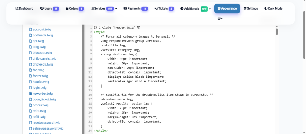
Where to Paste This Code
You have two options for deploying this fix safely without losing it during a theme update.
Method 1: The WordPress Customizer (Recommended)
If you are running a WordPress frontend for your panel, log into your admin dashboard. Navigate to Appearance > Customize > Additional CSS. Paste the code at the very bottom and hit publish.
Method 2: Directly in your Theme Files
If you are editing the raw PHP/Twig files of your SMM script, connect to your Hostinger file manager or cPanel. Navigate to your active theme’s folder (usually public_html/app/views/your-theme/css/). Open your style.css or custom.css file, paste the code at the bottom, and save the file.
Clear your LiteSpeed server cache and your browser cache. Your new order page is now perfectly aligned.
Need a more complex theme modification or a custom payment gateway integrated into your panel? Visit my Contact page to request custom module development.